We have our Theory and we have our Toolkit. So what happens when you apply this to Museum Maps? What can this suggest about Museum Space, and about power?
I’ll repeat my caveat – as I was the one applying this toolkit, any observations reflect my positionality, and my previous encounters with both museums and maps.
Numbers
My first observation was that Numbers are a key icon. By having numbered rooms, maps could suggest a specific path along which to travel. Interestingly, this path didn’t have to conform to physical reality.
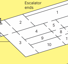
Take this example from the National Portait Gallery. The numbering of rooms suggests a path from room ‘9’ to room ‘10’ that is only possible by traveling through room ‘3’. While a visitor may follow this path and physically travel through room ‘3’, they might not actually travel through the produced social gallery space of the room. Following the map, they might not engage in a place they might have initially engaged in.
Following this line of thought, you could argue that the numbering of rooms on a map unravels the space. Rather than multidirectional, there is a strong cartographic suggestion to travel linearly. This complex physical environment is simplified to a single line.
This matters, because the icons – the numbers – were attached to designators via the key. The designators were periodisations. The linear space reflects a linear canonical art history. The map hides the territorial conjecture of linear time with the cartographic imperative for linear travel. Museum space is flattened.
Pictographs
Moving to The Natural History Museum, we find rooms with pictographic icons. The Icons do not and cannot wholly represent the content of a room, potentially misleading a visitor. The Dodo, for example, is attached to the designator ‘Treasures (Cadogan Gallery)’. The icon strips any extraneous data, misrepresenting museum space. At the same time, by depicting the Dodo, it privileges it. This space is centered on the presence of the dodo, relegating any other objects.
This suggests a great power in what pictograph is chosen as an icon. Depending on what pictograph is chosen, a visitor could construct museum space very differently.
Colours
I ended up considering colours as a sort of meso-icon. By this I mean blocks of colour seen on a map can contain within them micro-icons, while themselves existing in the macro-map. They sit between pictographs and the whole assemblage.
However, these colours could be analysed the same way. The most interesting observation was that colours were often used to group together disciplines in museum space.
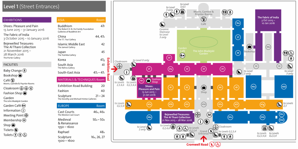
Take The V&A, for example. This map, from 2015, states that Orange means Asia. This could suggest, to a map-reader, that anything not orange is not related to Asia. The colours draw a distinct boundary between Asia and Europe, reinforcing socially constructed distinctions. Colour, here, upholds disciplines through the map.
Also of note, the blue sections – labelled Europe – are not connected physically. They are only connected through colour. This will be revisited in Re-Mapping the Museum, but it creates a world in which cartographic space is disconnected from material reality, allowing for new ways to produce museum space without materially altering physical space.
Now, of course, colours can be used for ease of communication. It is worth remembering that Un-Mapping is a tool to spark ideas, and its over-application could over-complicate discussions. While we are looking at symbolic analysis, it is worth bearing in mind practical considerations.
Permissible Space
The Map does not equate to the building. It tells us where we can and can’t go, and we accept that as fact. (Do not take this as an incitement to open random doors!)
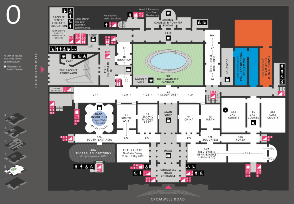
Looking at this map of the V&A from 2020, we can see that the footprint of the museum is shown as a dark shadow. In its isometric cross section, we can see areas which are to be considered the museum, and areas which are inaccessible.
This suggests that the map constructs museum space in a way different to the architecture. It locks and unlocks certain doors or pathways. Of interest to Museum Studies scholars, it shows a difference between The Museum as Building and The Museum as Space.
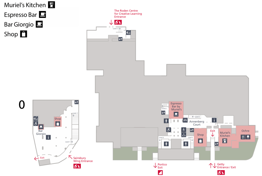
Looking at this Map from the National Gallery, we could also infer that the map differentiates between what is the ‘real’ museum, and what is peripheral. Here, colours are used to separate the cafe from the gallery space. A cartographic claim that they are ontologically different.
Trails
The most interesting observation I found through Un-Mapping will lead us into Re-Mapping: Trails.
By highlighting certain icons, the map can arguably shrink museum space, making only certain exhibits relevant to a map-reader’s experience.
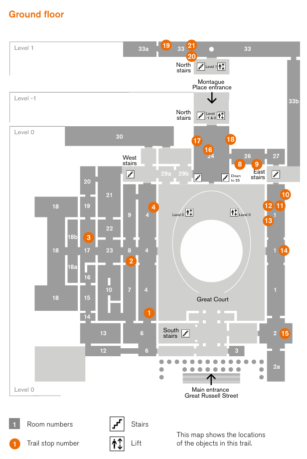
This can be problematic. Take the British Museum’s Collecting and Empire trail, for example. By platforming 21 orange icons, it suggests that only these 21 objects are relevant to the theme of Collecting and Empire – a laughable claim – especially since the Benin Bronzes aren’t even included on this trail. Here, knowledge can be seen to be restricted cartographically.
This could be interesting, though, as it allows for the production of non-contiguous museum space. The icons highlighted on a trail are essentially their own gallery, not beholden to physical restrictions, but existing in the cartographic space produced by the map.
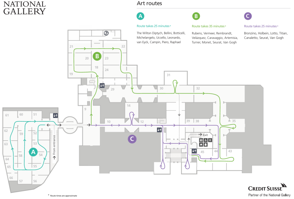
Another potentially problematic use of trails is the use of arrows, as seen in this National Gallery map from 2021. Here, the map suggests a correct and sequential route through the gallery. Accompanying the theory that architecture can create pathways, here, maps also create pathways, simplifying and smoothing out complex space.
However, trails can be exciting and challenging in positive ways. Outside intervention, by creating a trail on an already existing museum map, you can re-frame and re-produce museum space. By altering the map, you can alter museum space without even having stepped foot in the door.
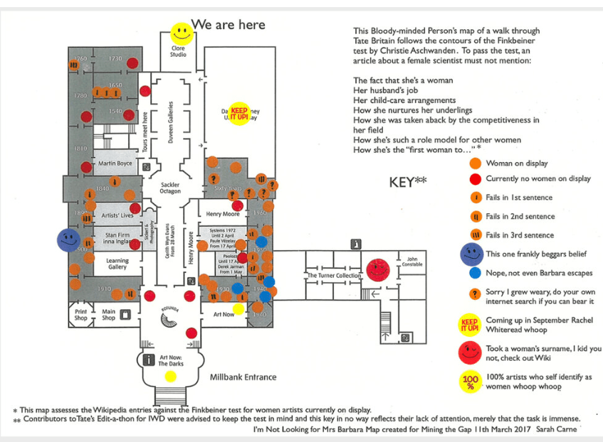
I use the example of Sarah Carne’s artwork I’m Not Looking for Mrs Barbara (2017). Rooms are marked based on whether they feature female artists, and whether the artists are described predominantly in relation to men. This outside intervention re-shapes the Museum Space of Tate Britain around a feminist question. Anyone using this map will encounter museum space differently than those using the regular map.
This segues us into Re-Mapping the Museum. Whether you work in a museum or art gallery, or are a complete outsider, by messing around with maps, we can change how museum space is produced. This is a form of artistic intervention – more precisely a cartographic intervention.
If Un-Mapping the Museum can help us think about what assumptions lie at the heart of museum space, then Re-Mapping the Museum can lead us to producing new museum space with our values and aspirations at its core.
